David Bowie – The Next Day: 2013/ Heroes: 1977

image

image

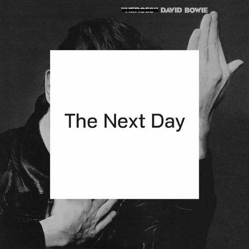
The first album by Bowie in over 10 years and he recycles an old album cover – genius – Bowie wanted to represent “forgetting or obliterating the past” by obscuring the photograph from the 1977 album Heroes, photographed by Masayoshi Sukita. The album was kept as secret as possible, and then a huge campaign, designed by Johnathan Barnbrook exploded all over the walls,the internet, and the papers. The campaign was simple – stick a massive white square over any other musical commercial reading “The Next Day – 03.12.13.” 

image

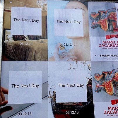
Some of the images, like those above, were constructed for the campaign a lot more, but the image below is literally forgetting the old and posting the white square over another band’s poster, in this case Foals.

image

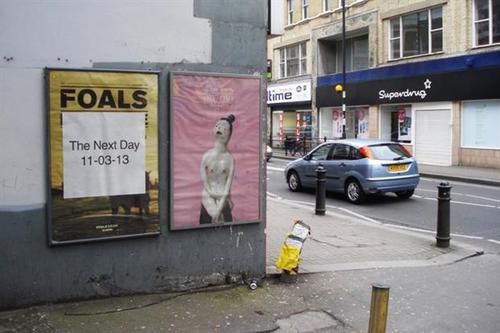
I don’t know how happy some of the other bands were, but the hilarious advertising helped the album jump to the number one album spot for the ninth time. The designer Johnathan Barnbrook had the chance to create his third work for Bowie and decided to show off a new font.

image

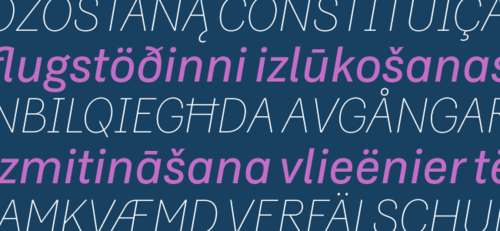
The font, Doctrine, is a sans-serif font that is clean cut and reads well on both a large and small scale. The font started from the North Korean National Airline livery on the side of the plane and evolved from there. On the packaging it looks extremely professional and not too industrial.

image

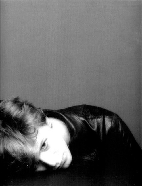
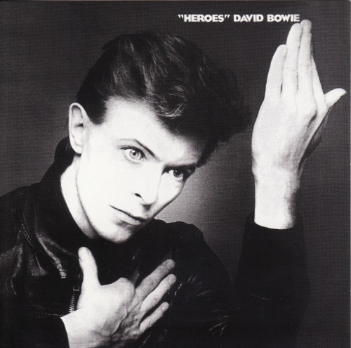
The photography of the original Heroes cannot be ignored however, and the photographer Masayoshi Sukita went through multiple shots with Bowie before the perfect one was chosen.

image

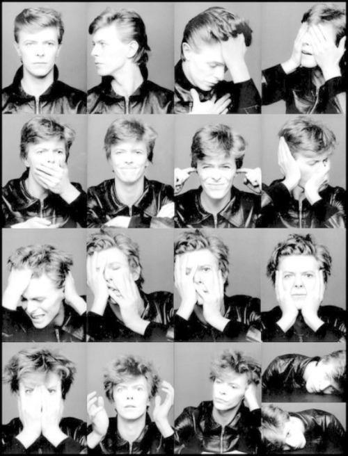
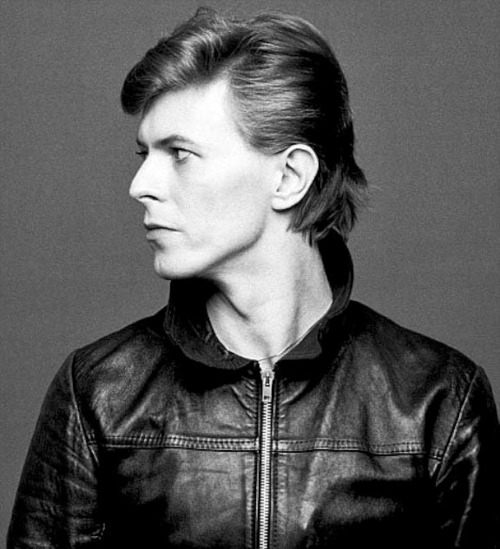
Many of the shots look fairly messy and not fit for an album cover, whereas the final shot makes Bowie look extremely on point and is probably one of the most famous pictures of all time. The picture below is my favourite that wasn’t chosen for the album, it is however slightly too similar to the cover of his album Low.

image

The idea of the white square works on all platforms and the vinyl design is as simple as it gets, the white square spinning around on the record player leaving a blurred circle in its wake. The simplicity of the design and the comedic value it carries with it make it a brilliant album cover and the perfect marketing scheme due to its minimalistic thought provoking qualities.

image

∆ Alt-J – An Awesome Wave: 2012 ∆

image

The album cover for Alt-J’s An Awesome Wave looks like a network of psychedelic veins coursing over the front of the cover. The image in fact is called “Gange’s dazzling delta” and was taken by the European Space Agency.

image

The image above shows the image just as it is on google earth – the image used for the album cover is a superimposition of three photographs taken by an Envisat Advanced Synthetic Aperture Radar on the dates 20/01/09, 24/02/09 and 31/03/09. The colours in the image are created by the differences in each image as there is no colour in a standard radar image.

Another image similar to the one used by Alt-J is the one shown below, which highlights the flooding in Bangladesh, an equally striking image that contains the area that is used on the album cover.

image

As you can see in the highlighted area, the album cover is contained within this separate image that was taken two years earlier on 12/04/07 and 26/07/07. The city of Bangladesh can also be seen at the left corner of the box like a white stain on the image.

The imaged used for the album itself matches perfectly with the music inside with each track flowing through the listeners head as – quite morbidly – the floods did through Bangladesh.

image

The colour combined with the soft faded grey tones of the songlist on the back creates a contrast between the two and separates you from the visual and the practical side of the music, which together won them the Mercury Prize in 2012.

The strange leaf shapes on the songlist at the back seem like separators on the album, but are in fact named tracks, the first being Ripe and Ruin, the second Guitar and the third Piano. The not so secret tracks confuse the listener but are also a pleasant surprise, adding perfect segues into the structure of the album.

image

The indie rock band have continued in this vein and have used bright strokes of colour in the promotion of their new album This Is All Yours that lands in September 2014.

Cabaret Voltaire – Micro-Phonies: Neville Brody 1984

image

image

image

image

The album Micro-Phonies by Cabaret Voltaire was art directed by graphic design heavyweight Neville Brody in 1984. Brody’s infamous typography features on the front and a bandaged figure spouting liquid from the mouth stares blankly at the viewer. Being heavily influenced by the punk movement, his design seems to fit the Dada-inspired and punk-thriving band’s sound and vision.

It wasn’t the first time Brody had worked for the band however, their 1982 album 2×45 had Brody’s design on the cover of the 12″ vinyl release.

image

The rugged industrial style of his design matched the industrial sound the band brought to the world several years earlier.

image

Shown above is a much more colourful cover that Brody designed for the single “James Brown,” that leans slightly more towards the punk movement at the time. His style gels completely with the band because the colours scream out at you in such a way that it isn’t garish but communicative of the way the band want to represent themselves. I couldn’t imagine the album cover looking any other way.

One of the videos from the album, “Sensoria” (shown below), was voted best album by the Los Angeles times in 1985, and the quick-cut crazily trippy video later found its way into the hands of the New York Museum of Modern Art because of it.

Cabaret Voltaire – “Sensoria” from the album Micro-Phonies.

The poster for the album can be seen in the film Ferris Bueller’s Day Off (shown below) an odd choice by the set dressers in such a mainstream film, as the majority of the audience won’t be familiar with the Sheffield band’s music or name, which doesn’t feature in the film other than on this poster in his bedroom.

image