Blur – Think Tank: 2003

image

image

The album artwork for Blur’s 2003 album Think Tank was created by the legendary Banksy, famous London street artist and renowned worldwide as the world’s leading graffiti artist. Banksy doesn’t normally head down the commercial route – tending to do all work off his own back – so it was a surprise to learn that Banksy had let Blur pay him for this album cover.

image

“I’ve done a few things to pay the bills, and I did the Blur album. It was a good record and [the commission was] quite a lot of money. I think that’s a really important distinction to make. If it’s something you actually believe in, doing something commercial doesn’t turn it to shit just because it’s commercial. Otherwise you’ve got to be a socialist rejecting capitalism altogether, because the idea that you can marry a quality product with a quality visual and be a part of that even though it’s capitalistic is sometimes a contradiction you cant live with. But sometimes it’s pretty symbiotic, like the Blur situation.” As well as the commission, the album art was sold for £75,000.

The unaltered and roughly displayed artwork reflects the rough, alternative style of the band, but the use of big shot Banksy also reflects the extremely popular nature of the product.

The art on the front is very similar to another stencil Banksy created two years later of two policemen kissing – a work that fetched £345,000 at an Auction in the US.

image

Slow Children – Slow Children:1981

image

image

(my scanner wasn’t big enough for full record sleeves)

I bought this album recently purely because of the artwork and it turns out that the debut album from Slow Children is actually a brilliant album, with a sound similar to that of Blondie or The B-52s. It has one of my favourite album covers of all time and the concept behind it is excellent. It is an adaptation of a scene in Jean Cocteau’s film The Blood of the Poet and it is referenced on the front and back of the album.

image

The film looks absolutely mental, but it looks like it has some artistic qualities that i’m interested in. Some of the stills from the film are brilliant, the black and white being key to the aesthetic of the film (whilst being the only film available. The adaptations on the covers are taken from the following stills:

image

image

As you can see, they have replicated the film well and put their own twist on it with the band member acting in the mans place, the silent part of the film allows for the expressions to be extremely exaggerated, making a still from the film extremely theatrical and easy to copy.

Another still from the film that I really like is the one below, it is framed really well and although I couldn’t guess what was happening from this still, it is intriguing enough for me to want to watch the entire film. You can see the entire film here: https://www.youtube.com/watch?v=RomiX0YTqKI

image

Sigur Rós – Ágætis byrjun: 1999

image

image

The artwork on front of Ágætis byrjun was originally done in ballpoint pen by artist Gotti Bernhöft, the design was then inverted and placed on the front of the cover.  Ágætis byrjun translates to “A good beginning,” so the foetus on the front seems like an apt cover for the album. The alien nature of the foetus also fits the band because, although not on this album, they sing in a completely jibberish language and to many people the icelandic sounds can seem pretty alien.

Sigur Rós actually assembled and glued the first print of the album themselves. A lot of the albums were rendered useless because of the shoddy job they did.

Tame Impala – Innerspeaker: 2010

image

image

Tame Impala’s album Innerspeaker was created by Australian artist Leif Podhajsky, an artist who has created many other great album covers over the years including Bonobo’s 2013 masterpiece North Borders and Kelis’ most recent album Food. The picture itself is of the Great Smoky Mountains National Park in North Carolina, USA and he has altered the image with the Droste effect to make it seem as if the image is going in on itself. The effect is mind numbing and was named after the dutch cocoa brand Doste, which featured a maid carrying the identical packaging that she was featuring on on her tray.

The bright colours and the psychedelic effect match perfectly with the bands psychedelic sound, vision and image. I have seen them live, and album cover echoes the video that plays along to their set. Even the inside of the vinyl echoes a sound wave and is extremely easy on the eye.

Leif Podhajsky’s style is one I deeply admire and his impact on the psychedelic album covers of today has been huge. I hope to do a post about his work soon.

(this hand doesn’t belong to me)

Queen – News of the World: 1977

image

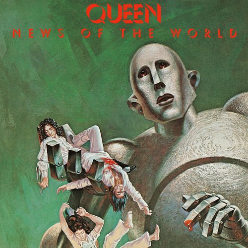
Queen are almost the biggest band in the history of music, creating one hit after another, the album News of the World contains two of their biggest hits – We Will Rock You and We Are The Champions. The album went 4x platinum in the US and 2x platinum in the UK.

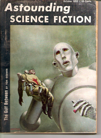
For such a big name the album cover had to be good, and they delivered. By taking the front cover from the October 1953 edition of Astounding Science Fiction and placing the members of the band into the robots hand, they have created an extremely eye-catching cover that really pops out on the shelf.

image

The artist behind the original artwork is Frank Kelly Freas, an artist renowned for his illustration in the sci-fi business, who they contacted and asked to repaint the artwork to get the desired effect of the dead band members in the robots hand.

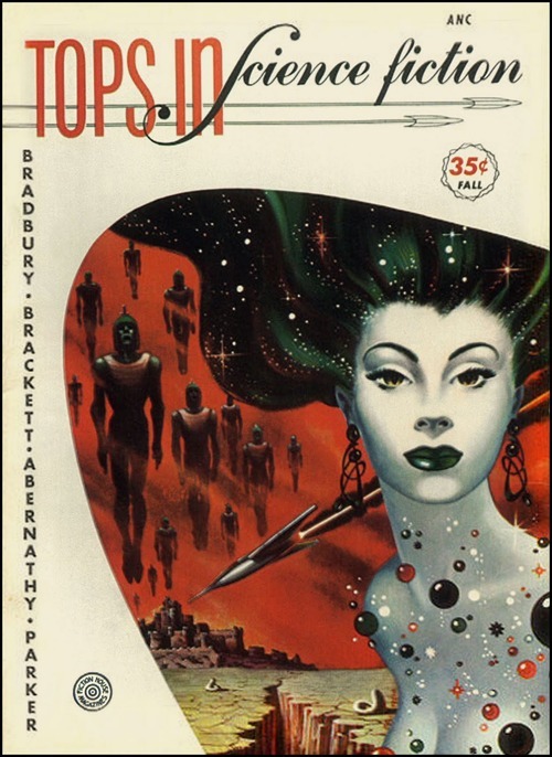
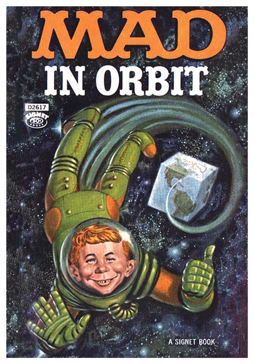
Other work by the artist includes many science fiction book covers, some shown below. He has won the revered Hugo Award ten times for his illustration so is the perfect choice for the award winning musicians.

image

image

Joy Division – Unknown Pleasures: 1979

image

image

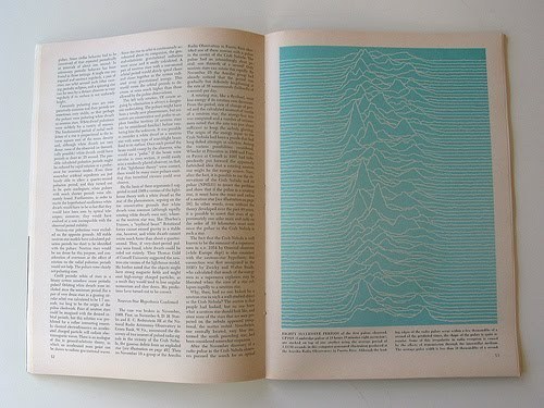
One of the most famous album covers in the whole universe originates from PSR B1919+21, a “pulsar with a period of 1.3373 seconds,and a pulse width of 0.04 second.” Picked up by Peter Saville, one of the best graphic designers in England, he transformed something extremely scientific into a design so famous people can recognise it without having any idea what it is.

Technically the design was initially the bands idea because they had handed him a folder of astronomical images from the Cambridge Encyclopedia of Astronomy and all Peter Saville had to do was pick the correct one and go with it. The choice was perfect – he picked the design because it demonstrates both technicality, sensuality, rhythm and a shape like that of a heartbeat.

image

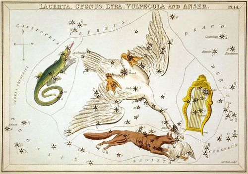
The pulsar originates from the constellation Vulpecula, shown above.

Peter Saville and the band also decided against putting the bands name on the front due to the post punk movement and the band not wanting to become “pop” stars at the time.

Nick Drake – Pink Moon: 1972

image

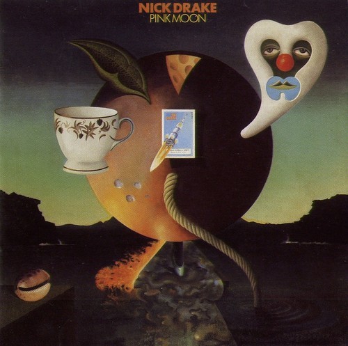
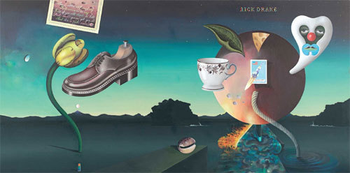
Pink Moon is one of my favourite albums of all time, with a cover that matches the creative spirit of the genius that was Nick Drake. The cover displays a Dali/Magritte quality, displaying the predominant “Pink Moon” in the centre of the work.

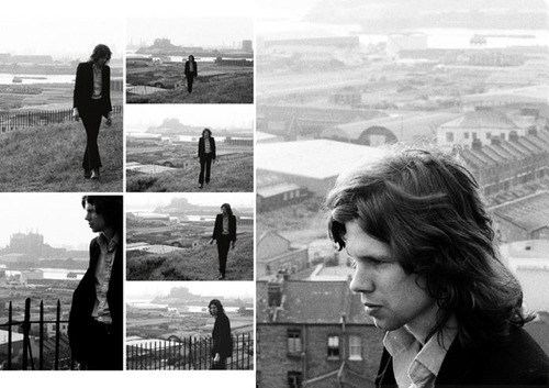
Keith Morris was commissioned to photograph Drake for the cover of the album (because of the success of his photography on the 1970 album Bryter Layter) but the photos taken weren’t used, as Drake’s figure and complexion became weaker and lighter as his depression continued and his marketing team decided against the promotion of his current state.

image

Nick Drake was very vague with what he wanted on the front of his new album and the only thing his friends could gather from him was that he wanted a pink moon on it. A friend of Drake’s sister, Michael Trevithick had a surrealist style to his name and his label decided that he was the perfect man for the job. Drake never gave a formal opinion on the album cover itself but his friends seemed to gather that he was as happy with it as he could be at that point in his life.

Rolling Stones Magazine said “The beauty of Drake’s voice is its own justification. May it become familiar to us all.”

image

New Order – Power, Corruption & Lies: 1983

image

image

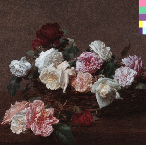
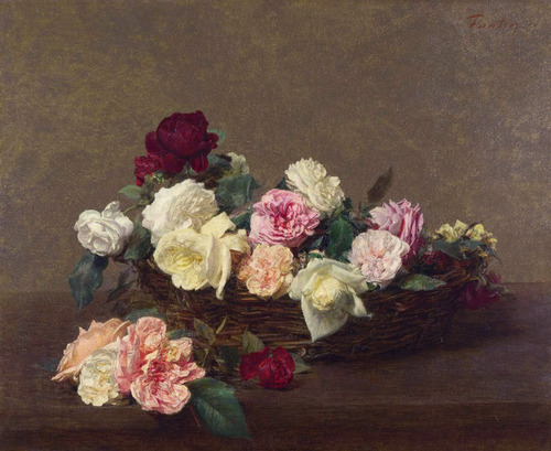
Peter Saville is the brains behind this album cover, or rather his girlfriend is. Whilst looking for a machiavellian painting (to fit the title) at the National Gallery, Peter Saville wandered into the gift shop and picked up a postcard of the painting shown above. His girlfriend came up behind him and questioned whether he was going to use it as the cover and without a shadow of doubt he decided on it there and then.

image

Peter Saville is the creative genius behind the infamous Joy Division album Unknown Pleasures and many other great album covers, but despite how iconic the Joy Division cover is, I still love the Power, Corruption & Lies design more. The way he has taken the colour palette from the image and collated it into a little key in the corner as if to say the artist has painted by numbers or cheated, pointing towards the title of the album.

With one of the best graphic designers in England, it’s hard to go wrong, and Peter Saville has proved his worth once again.

Aphex Twin, Windowlicker: 1999

image

image

We’re all familiar with the creepy Aphex Twin single Windowlicker, and the model’s body with Richard D. James’ head superimposed onto it, which makes it all the more weirder that when you see the real model as she is the one who looks photoshopped. Some have gone as far to say that Richard D. James’ version is hotter, but after watching the video for Windowlicker itself, I am inclined to disagree completely.

No one has any idea who the woman is, which is just as well really, because the infamy of Aphex Twin’s album cover may be a little too overbearing for the model.

The cover itself cannot be faulted, along with the glitch techno music from Richard D. James and the black hip hop video pisstake Chris Cunningham devised, it is the perfect package. Aphex Twin’s creepy smile will haunt you forever after you have experienced the entirety of Windowlicker.

Aphextwin windowlicker from M-Well on Vimeo.

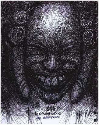
The video was so good, H R Giger took it upon himself to draw one of the characters from it, naming the image “The Windowlickers.”

image

image

This terrifying image sticks in the mind of any person who watches the video, and so does the song.

The National – Trouble Will Find Me: 2013

image

image

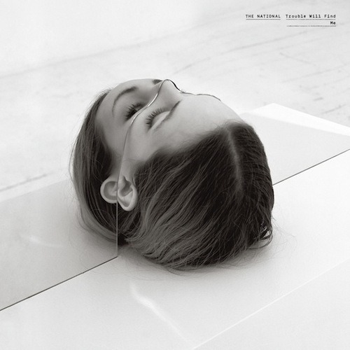
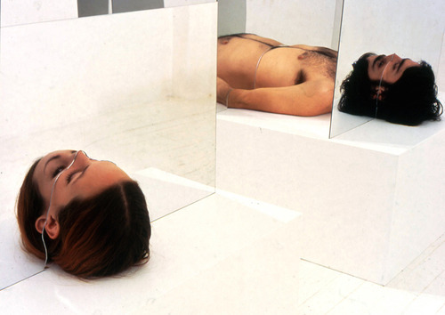
The cover for The National’s Trouble Will Find Me incorporates a cropped section of Bohyun Hoon’s work Fragmentation, a piece that has carved sections of mirror placed equally over naked human bodies.

The title of the album matches perfectly with the situation the woman would be in if she wasn’t part of a piece of art, the mirror acting as a guillotine on the cover, with no sense of what is below the top half of her head. The black and white image and the old typewriter style font combine to match the dark, melancholy songs that the National produce, especially on their new album.

image

The album cover is a slight change from their 2007 Boxer, with the text being the predominant component, it suggests a return to their roots and a more down to earth sound compared to their slightly more uplifting 2010 album High Violet.

The song “I Need My Girl” was the promotional song for the 13-track album and as it is the poster track it seems fitting for the picture on the front to be of a woman trapped in a seemingly inescapable trap.